I recently updated to Sublime Text 3. While doing that, I decided to take some time to upgrade my code editor’s looks and functionality. I spend most of my day on this app, so it should look and feel great.
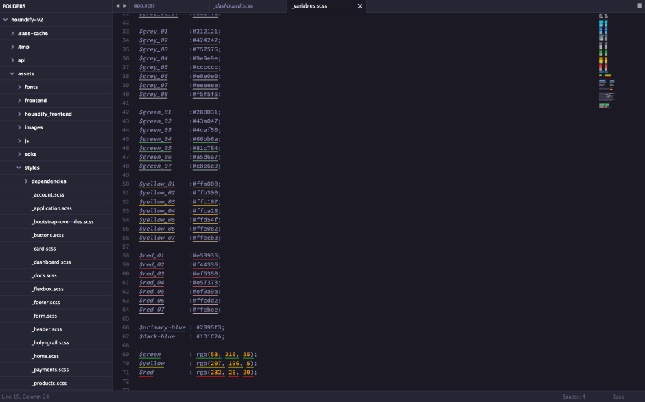
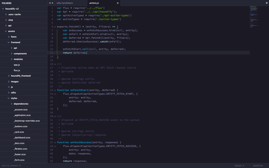
Here’s what my Sublime Text looks like.
Here are the plugins that I use:
- Hero Theme
- Emmet
- Alignment (Important to add
":"to your Alignment Settings Config - SASS (for syntax highlighting)
- Handlebars (for syntax highlighting)
- AutoFileName
- Color Highlighter
Notable exceptions include:
I’ll probably add these as I need them.
My Sublime Settings file also has some nice tweaks. Here’s a gist of what it contains.
Some of you may argue that this theme is too monochromatic, and doesn’t distinguish different keywords by color. Having used highly colorful themes in the past, I realized that the extra color doesn’t help 95% of the time. The monochromatic blues feel more zen to me.
Add your Sublime Text secrets in the comments, or tweet to me @tilomitra.


Very impressed!