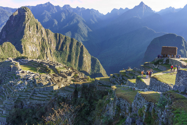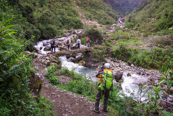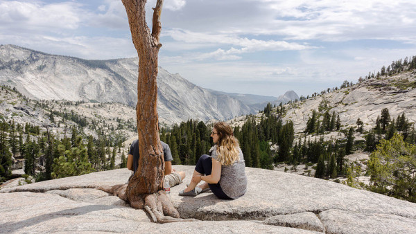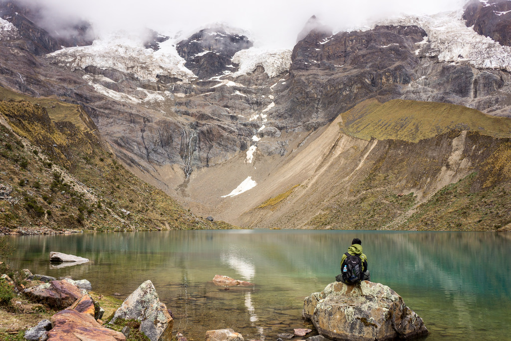
I’ve always dabbled in photography, but decided to take it a little more seriously about 18 months ago. I travel a fair bit and wanted to take better photos so I remember the good times spent with family, friends, and my own thoughts.
Once I came to this realization, I naturally started researching and learning everything I could about photography. There’s no shortage of content out there and I quickly became overwhelmed with all the information. I wasn’t sure where to start.
The most important factor to taking a good photo
As I disseminated the information out there, I realized that the most important thing to taking good photos isn’t your ISO setting, lens type, or time of day. It’s composition. [highlight]Almost any well-composed photo can look good, given the right amount of post-processing. Every other tool in a photographer’s disposal can help a well-composed shot appear even better, but they can’t save a poorly composed one.[/highlight]
The hardest part is understanding how to compose a good photo. I have developed a few tips to help me figure this out.
A quick note before continuing: I’m the type of guy who takes a lot of photos during a trip (200-250 a day). After I’m back, I cull them, find the best 5-10%, and post-process them in Adobe Lightroom. These tips will probably make the most sense if you follow a similar pattern.
You don’t need any special equipment, although I do recommend getting a good DSLR camera with a decent all-round lens that can shoot in RAW mode. However, these tips should be applicable to most new smartphones as well. The photos won’t turn out as well, but they’ll still be pretty good.
Ok, let’s get started.
Leading Lines
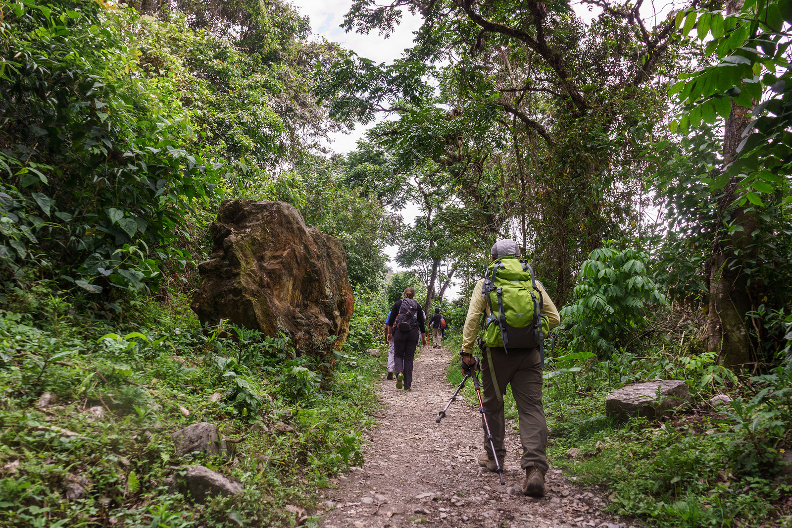
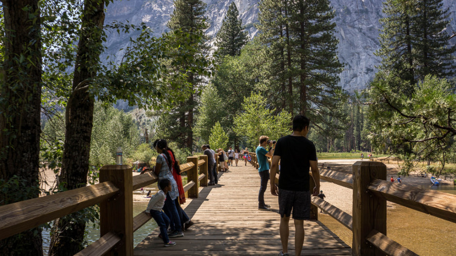
This is the easiest way to compose a photo in an interesting manner. Try to guide the viewer’s eye towards an interesting subject, or towards the horizon.
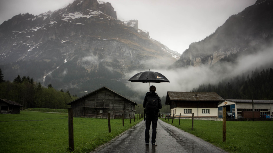
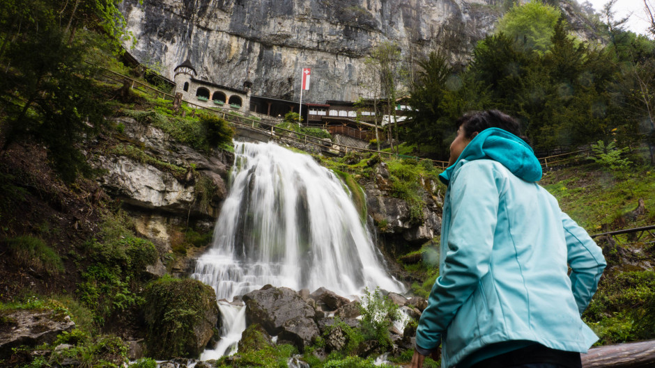
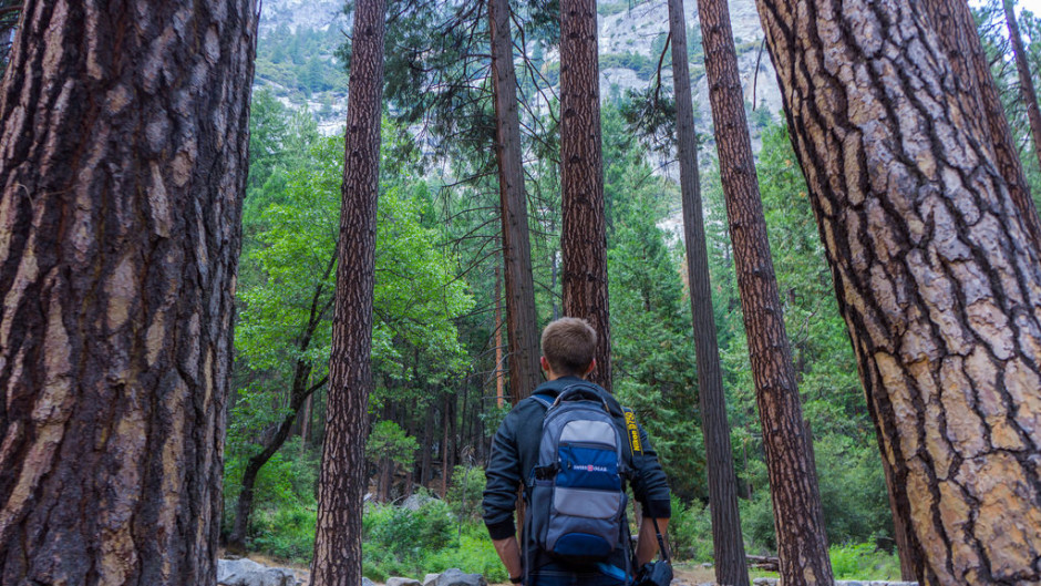
Another way to accomplish this is to let the person inside the photo look at something interesting, instead of at the camera.
Sense of Scale
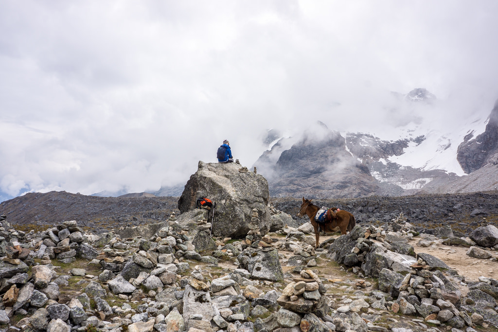
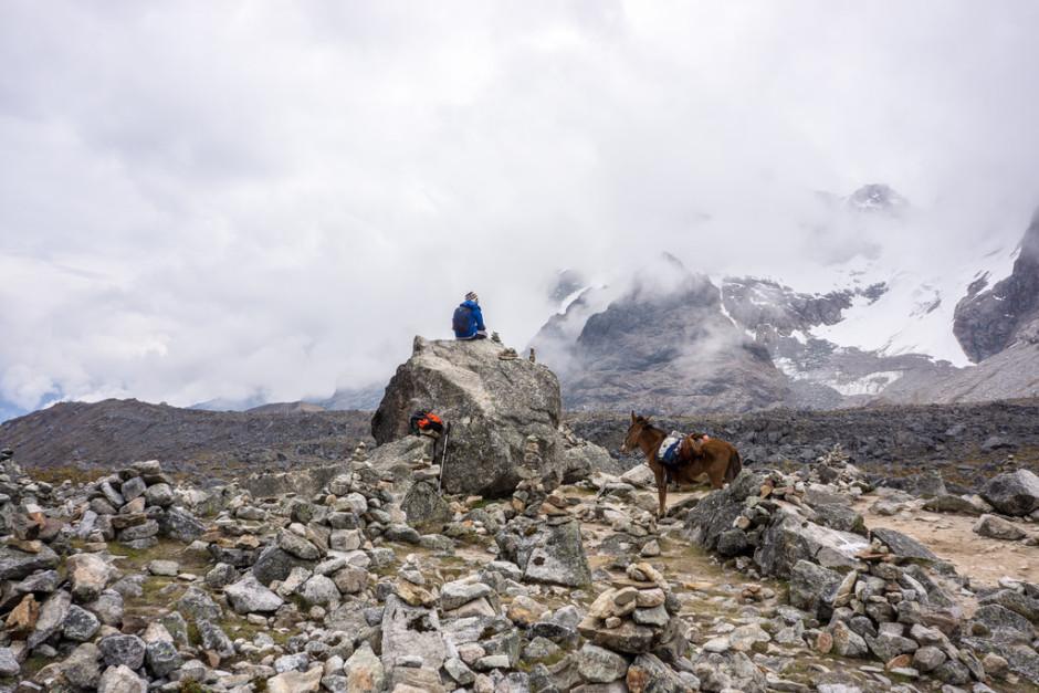
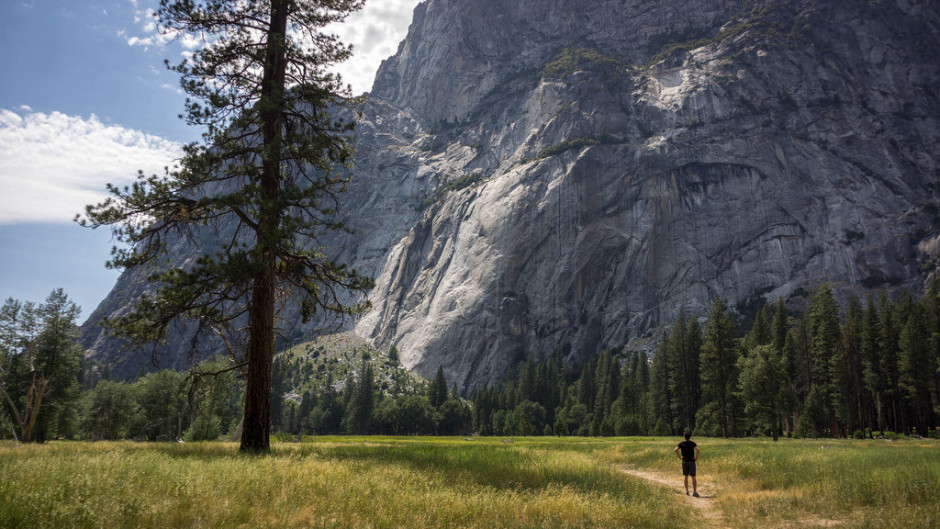
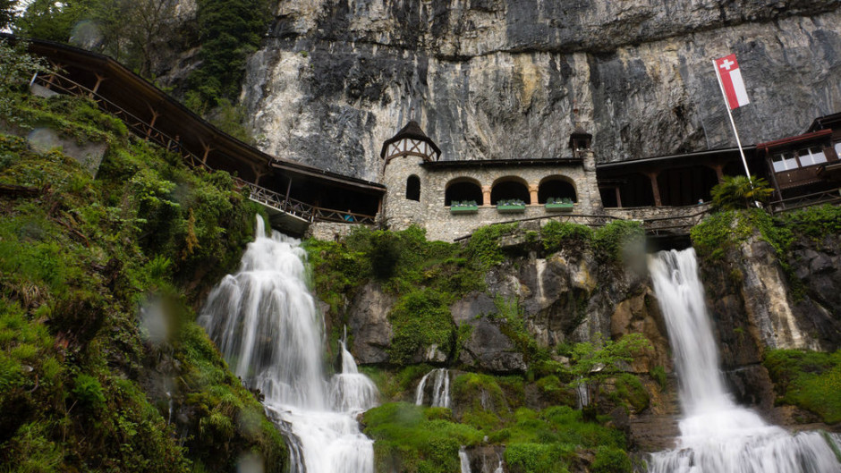
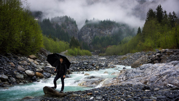
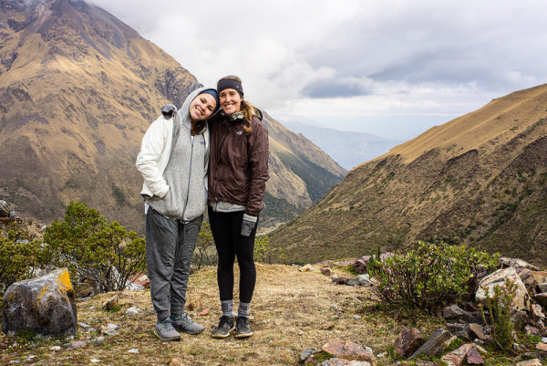
This technique works best with landscape photos. Instead of just snapping a photo of the landscape, give a sense of scale by including a person, a building, or another object in the photo. It usually ends up making the scenery look better.
Layers
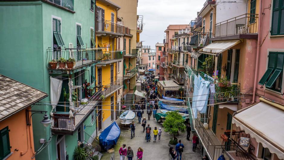
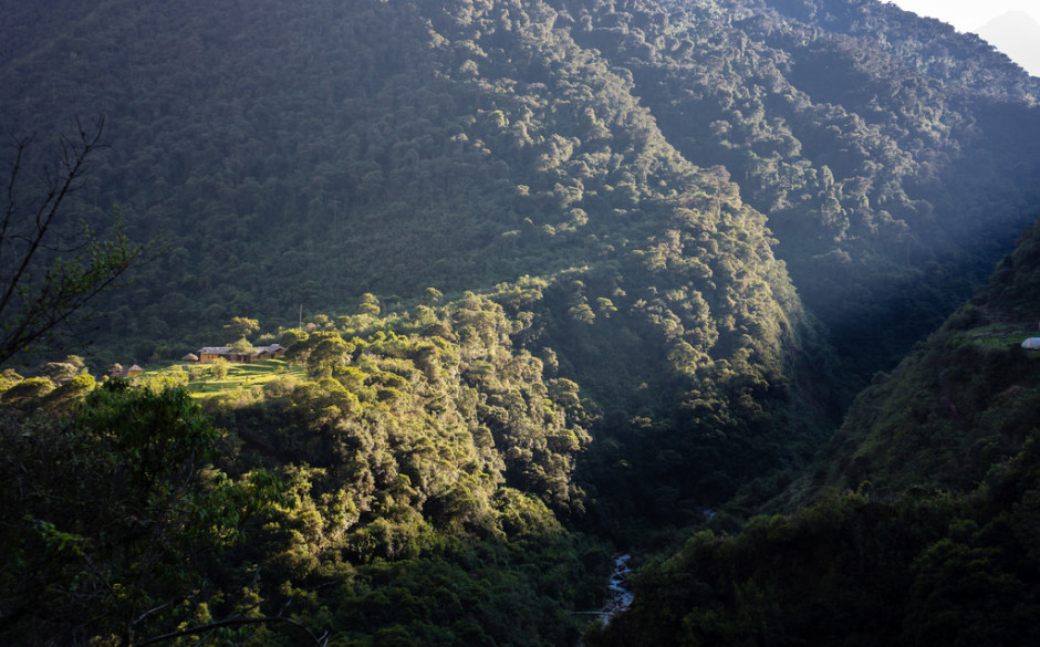
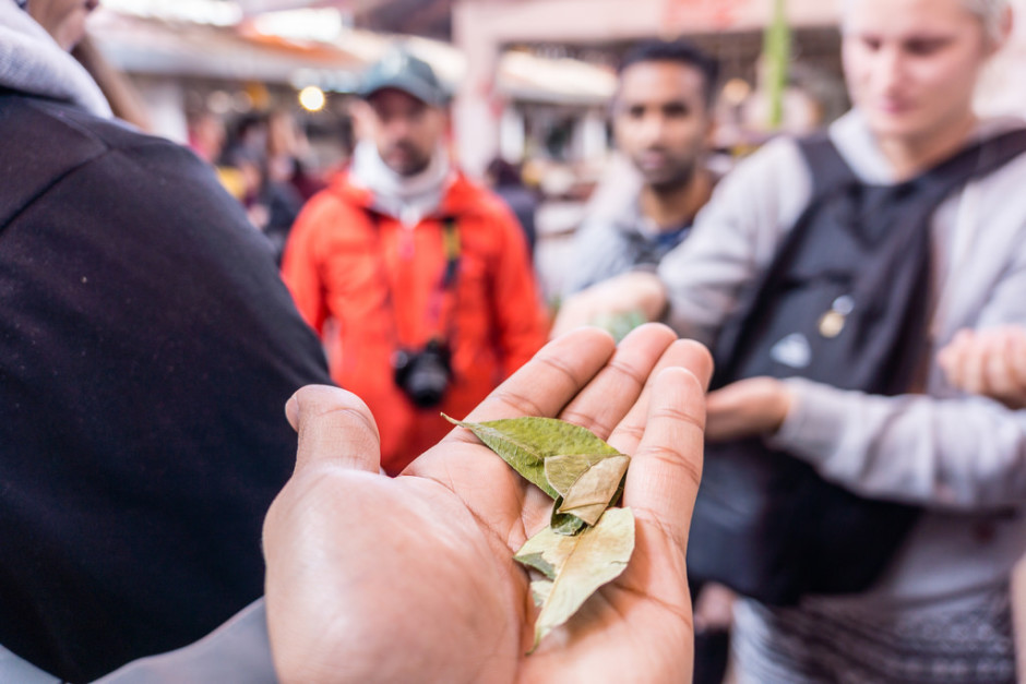
Combining foreground, middle-ground, and background well usually results in a much more interesting shot. Don’t be afraid of blurry foregrounds either.
Symmetry
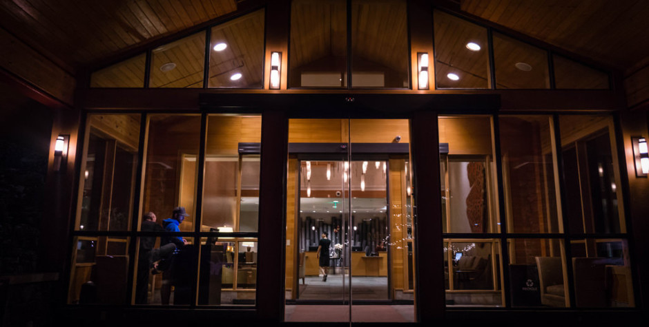
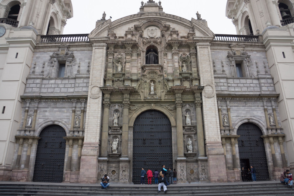
The human eye loves symmetry. Try to include it in your shots. This usually applies when taking pictures of buildings or reflections.
Show Life
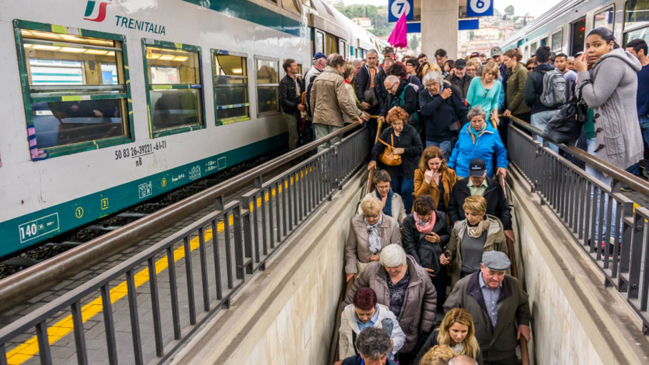
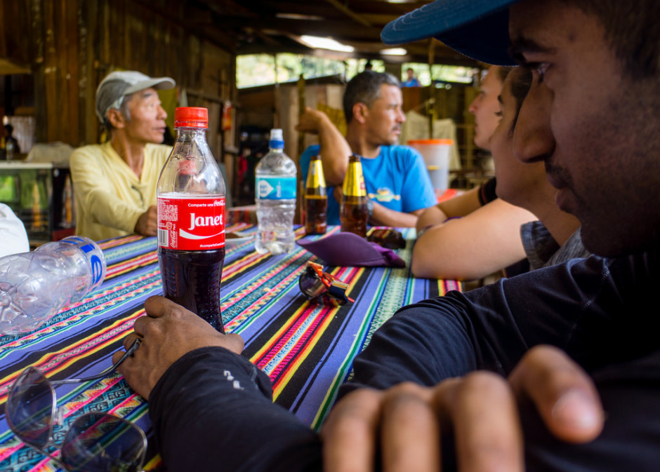
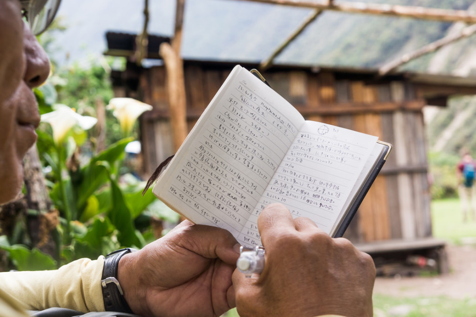
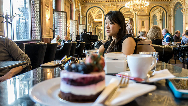
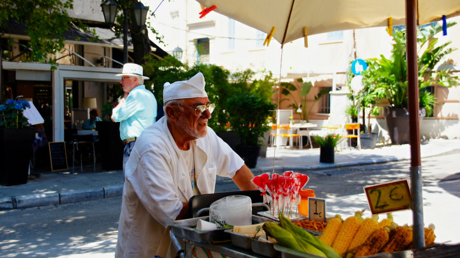
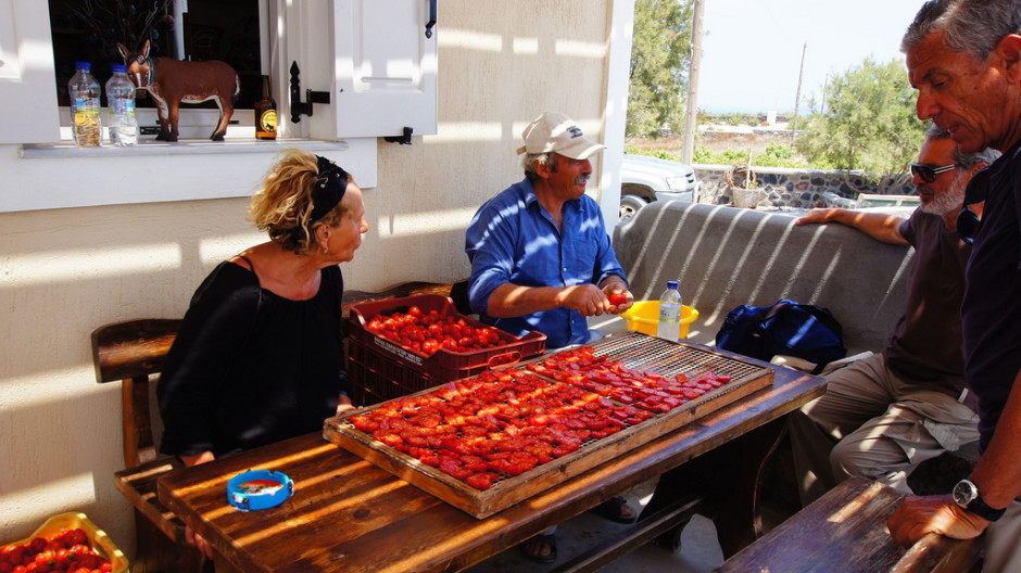
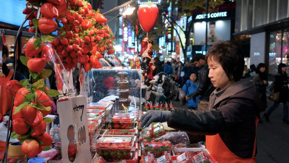
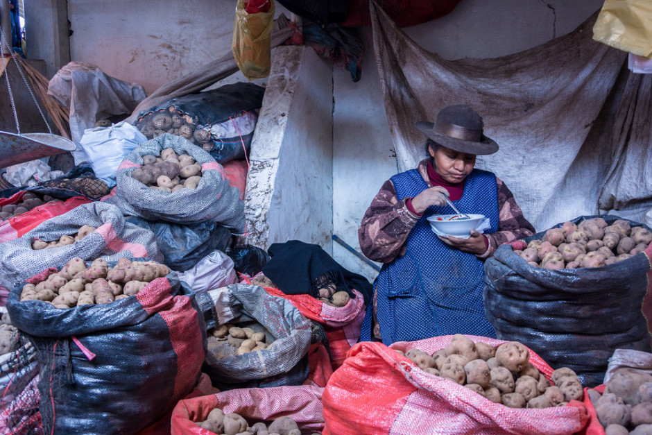
Photos with people generally look more interesting than photos without. Don’t be afraid of taking photos of people going about their business. If you’re shy, just ask and they’ll most likely be cool with it.
Rule of Thirds
Sometimes, none of the techniques above make sense for the shot you are trying to take. In these situations, use the rule-of-thirds. Take the primary object in your photo and put it on one of the intersections of the grid within your camera instead of at the center of the shot.
Post-Processing
In the next post, I’ll be talking about how I post-process photos to improve their appearance. Post-processing is extremely important to my workflow and can really bring out the details in a shot. As an example, check out this picture before and after being post-processed.

Follow me on Twitter to find out when I publish that post, and check out my photo albums on Flickr.
