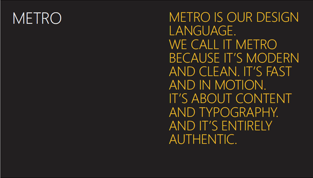
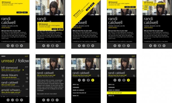
Completely agree with Microsoft on this one. I am starting to prefer WP7’s UI over parts of the iOS user interface, and it is vastly superior to Android in terms of design and user experience. I think it’s time Apple made some adjustments to the iPhone interface because it’s starting to look a little dated to me.
As WP7 evolves, it’ll be important for Microsoft to ensure developers follow Metro’s design principles as developers have done with iOS. 3rd party iOS apps often look much better than Apple’s native apps but they maintain a similar look and feel so that the user experience isn’t compromised. Similarly, Microsoft must ensure that developers stay consistent and don’t go overboard. Well designed apps go a long way in encouraging user adoption.
news app on Windows 8:


Metro’s design is super hot, on first look I love it. But I think it hurts in functionality, you can’t really display much info, and everything is very dark. Reading lots of white text on a black bg kinda gets annoying
You may be right. However, I prefer this to the skeumorphism that iOS leans towards. You’re right though, I haven’t tested it out over a long period of time.